
The Secret Language of Color for Your Brand
As a branding agency, we understand the power of a first impression. Studies show that up to 90% of that initial perception can be based on color alone. That’s why we don’t just pick colors that look pretty – we use color psychology to craft a visual language that speaks directly to your target audience. In today’s blog post The Secret Language of Color for Your Brand, we’ll delve into the fascinating world of color psychology.
For example, let’s take a look at me (the agency owner) in this photo. I’m wearing green, which embodies prosperity, giving birth to new things, health, and vitality. This shade perfectly reflects our brand’s commitment to guiding wellness brands, helping them secure clientele, and earning more income than they could have dreamed of. You can leverage it to elevate your brand, whether you’re launching a new campaign or embarking on a rebranding journey.
Here’s a breakdown of some key colors and the emotions they evoke:
- Red: Excitement, passion, energy, boldness. Ideal for brands that want to project a dynamic and confident image. (Think Coca-Cola’s vibrant red)
- Orange: Playfulness, warmth, enthusiasm, creativity. Perfect for brands with a youthful and approachable vibe. (Think Nickelodeon’s energetic orange)
- Yellow: Happiness, optimism, originality, intellect. A great choice for brands that want to convey a sense of positivity and innovation. (Think Ikea’s bright yellow)
- Green: Growth, nature, stability, peace. Well-suited for brands that promote wellness, sustainability, or a connection to the outdoors. (Think Starbucks’ calming green)
- Blue: Trust, security, reliability, calmness. A popular choice for brands in finance, technology, and healthcare. (Think Facebook’s dependable blue)
- Purple: Luxury, sophistication, creativity, wisdom. Ideal for brands that want to project a high-end and regal image. (Think Cadbury’s luxurious purple)
- Black: Power, elegance, sophistication, mystery. Can create a sense of authority or luxury. (Think Chanel’s timeless black)
- White: Purity, cleanliness, simplicity, peace. Often used to convey a sense of freshness or minimalism. (Think Apple’s clean white)
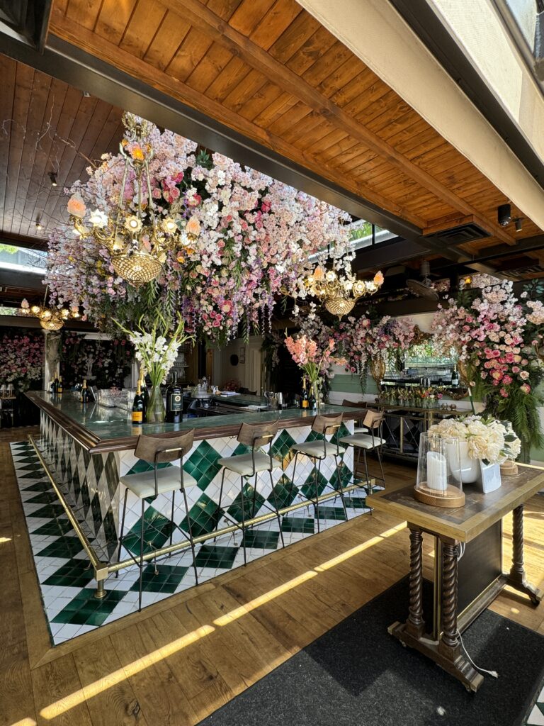
But remember, color psychology isn’t a one-size-fits-all formula.
Here are some additional factors to consider:
- Target Audience: What colors resonate with your ideal customer? Consider their demographics, interests, and cultural background.
- Industry Standards: Certain colors are traditionally associated with specific industries. For example, green is often used in the environmental sector, while blue is common in finance.
- Brand Values: What are the core values you want your brand to represent? Choose colors that align with those values.
Beyond the Basics: Using Color Psychology for Rebranding
Rebranding is a chance to hit refresh and ensure your brand continues to resonate with your audience. Here’s how color psychology can be a powerful tool during a rebrand:
- Evoking New Emotions: Does your brand need to project a different feeling? Choosing a new color palette can help achieve this.
- Modernizing Your Image: Color trends evolve, and a fresh color scheme can signal a move towards a more contemporary aesthetic.
- Strengthening Brand Recognition: Sometimes, a subtle shift in color tone can breathe new life into an existing logo while maintaining brand recognition.
The Secret Language of Color for Your Brand
Remember, color is a powerful tool in your branding arsenal. By understanding the psychology behind color and applying it strategically, you can create a brand identity in the wellness and lifestyle industry that speaks volumes and connects deeply with your target audience.
Ready to update your brand with new colors? Let’s chat!





Love this deep dive into the psychology of color in branding! 🎨 It’s incredible how much a color can communicate and influence perception. Can’t wait to apply these insights to our next campaign! 🌈 #BrandStrategy #ColorPsychology
Thank you, yes!